Door 1
Panel 1
Useful for service choices, benefits or installation steps.
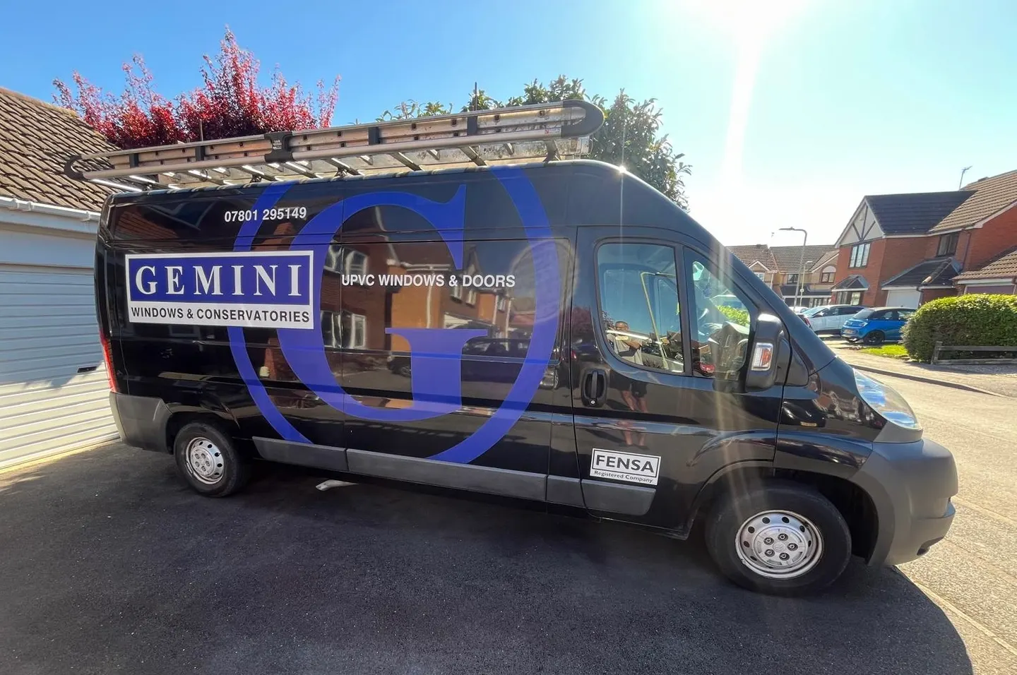
A working demo page for branded window and door motion, panel layouts and lead generation UI ideas.
Photos, rough sizes or just a quick message.
Gemini helps compare styles, colours and practical details.
Friendly advice, no pressure and a sensible next step.
Panel systems
Tall panels, arched tops and mullion lines for content blocks that feel closer to the product than generic cards.
Useful for service choices, benefits or installation steps.
Useful for service choices, benefits or installation steps.
Useful for service choices, benefits or installation steps.
Useful for service choices, benefits or installation steps.
Window grid
The columns drift differently as the section moves through the viewport, briefly lining up like a complete window.
Show grouped choices with movement that hints at opening panes.
Show grouped choices with movement that hints at opening panes.
Show grouped choices with movement that hints at opening panes.
Blind reveal
Square panes for compact content, with a reveal animation like a blind opening from top to bottom.
A simple visual format for benefits and problem/solution sections.
Useful for design-led prompts without needing a heavy carousel.
Hardware details
Door-lock shapes can hold stats, guarantees, FENSA proof or safety messages.
A slim hardware-inspired slot works well for call-back forms, quote prompts and brochure downloads.
Liquid glass layouts
Same component family, different layout counts. Window frames stay square; door frames use a separate class.
Light blue glass styling for calm lead-gen content blocks.
Light blue glass styling for calm lead-gen content blocks.
Good for option sets, benefits or product choices.
Good for option sets, benefits or product choices.
Good for option sets, benefits or product choices.
Compact step or checklist pattern with glass-panel styling.
Compact step or checklist pattern with glass-panel styling.
Compact step or checklist pattern with glass-panel styling.
Compact step or checklist pattern with glass-panel styling.
Takeover reveal
Each column has its own panes, so the layout reads as two actual reveal panels.
Two pane
Two sliding panes reveal focused lead-generation content.
Two pane
Two sliding panes reveal focused lead-generation content.
Alternative reveal
The cards themselves slide into place as the user scrolls, rather than panes placed over each card.
Two column
The cards themselves slide into place as the user scrolls.
Two column
The cards themselves slide into place as the user scrolls.
Alternative reveal
Side cards slide in while the centre card drops into alignment.
Three column
Side panes slide in while the centre pane drops into alignment.
Three column
Side panes slide in while the centre pane drops into alignment.
Three column
Side panes slide in while the centre pane drops into alignment.
Alternative reveal
Four cards move like a set of doors forming a clean row.
Four column
Four cards move like a set of doors forming a clean row.
Four column
Four cards move like a set of doors forming a clean row.
Four column
Four cards move like a set of doors forming a clean row.
Four column
Four cards move like a set of doors forming a clean row.
Window reveal
Three real columns, each with a three-pane reveal animation.
Three pane
Three panes move away in different directions to reveal the content.
Three pane
Three panes move away in different directions to reveal the content.
Three pane
Three panes move away in different directions to reveal the content.
French reveal
Four actual columns for tall French-door style layouts, each revealing independently.
Four pane
Useful for tall product systems or feature sets with a stronger door feel.
Four pane
Useful for tall product systems or feature sets with a stronger door feel.
Four pane
Useful for tall product systems or feature sets with a stronger door feel.
Four pane
Useful for tall product systems or feature sets with a stronger door feel.